Dashboard experience
KORE is a pioneer, a leader, and a trusted advisor in delivering mission critical IoT services and solutions. We help eliminate the time-consuming need to identify, evaluate, contract, and manage multiple network connectivity providers, equipment manufacturers, and professional services organizations as you build out your IoT solution. Along the way, we offer proven expertise and guidance that can help you maximize your IoT investments and transform IoT business performance.

My Role
We were 3 designers working remote from France and India every designer had a designated job, I worked as UX & Visual designer, we worked closely with a dedicated product owner, the lead tech and a remote development team at Alpharetta, Georgia. My role involved all stages of the product life cycle. I started with user research to help identify market needs. Using design thinking methodologies we tested hypotheses and iterated our solution to best suite the user needs and business requirements.
Design decisions were made
We followed a very structural framework to come to adaptable decisions keeping the cross country collaboration in mind.
Leveraged metrics such as click heat-maps, funnel drop-offs, watchlist improvement, screen recordings, and quantitative data to gain insights into user behaviour disparities between web and mobile platforms, facilitating targeted design enhancements.
Engaged in multiple user interviews to capture diverse user perspectives and document pain points across various aspects of the product.
Maintained regular communication with developers, involving them in the project from the outset to ensure the feasibility of designs, providing low fidelity prototypes as illustrative examples.

Pain points and Solutions
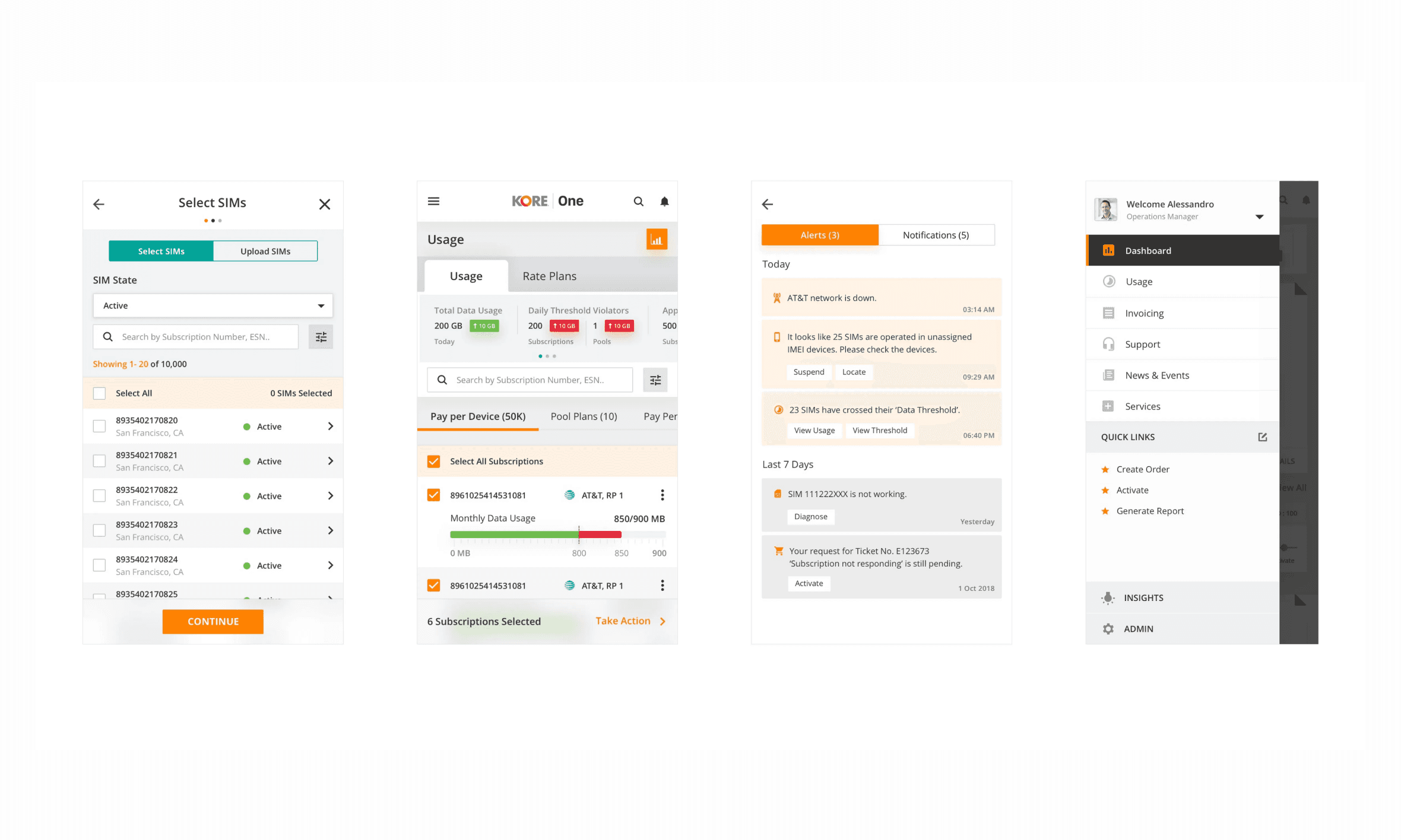
The dashboard previously was built keeping the needs of a very simple network in mind. It didn’t have provisions to expand into a fully-fledged management suite.
Erstwhile, the dashboard didn’t have features to meet complex business requirements like tracking IMEI, detailed system data at a glance with various filters, sending single/bulk network activated and deactivated requests and more.
It also didn’t afford product creation flows on mobile — a fast-growing requirement in today’s mobile-first sellers' revolution around the world.
Viewing the same segment of data in different visual formats was limited and not possible without cumbersome navigation and/or repetitive filtering.
Pain points and Solutions
Connection Information:
Overview: Provide users with general information about the network carrier, including connection details, connected hardware, and diagnosis reports.
Benefits: Enables network administrators and technical support personnel to analyze connectivity problems and interpret conclusions.
Analysis Results:
Diagnosis: Present event logs for analyzing connectivity issues and aiding troubleshooting efforts.
Provision Analysis: Focus on device and identity management to ensure secure and reliable network connectivity.
IMEI Analysis: Identify valid devices using the network for enhanced security and management.
Data Usage Graphs:
Per Day, Monthly, and Yearly Views: Visualize data usage patterns over time for a particular carrier.
Graph Types: Provide appropriate graph types based on the nature of the data, such as line graphs for continuous data and bar graphs for discrete data or categorical comparisons.
Benefits: Easy-to-understand data visualization helps users track and manage their data usage effectively.
System Details:
Comprehensive Usage Information: Display a detailed list of network usage, including timestamps and locations, with multiple filtering and sorting options.
Benefits: Network engineers can utilize this data to activate, deactivate, or suspend providers in specific regions efficiently.

The final outcome
User Control and UI Optimization: Users have complete control over the interface, with core metrics changing dynamically based on selected filters.
Responsive Design: The solution is responsive, catering to desktop screens wider than 1200px to enhance user experience.
Streamlined User Experience: Minimized clicks and reduced time consumption allow users to access and interpret the network data efficiently.
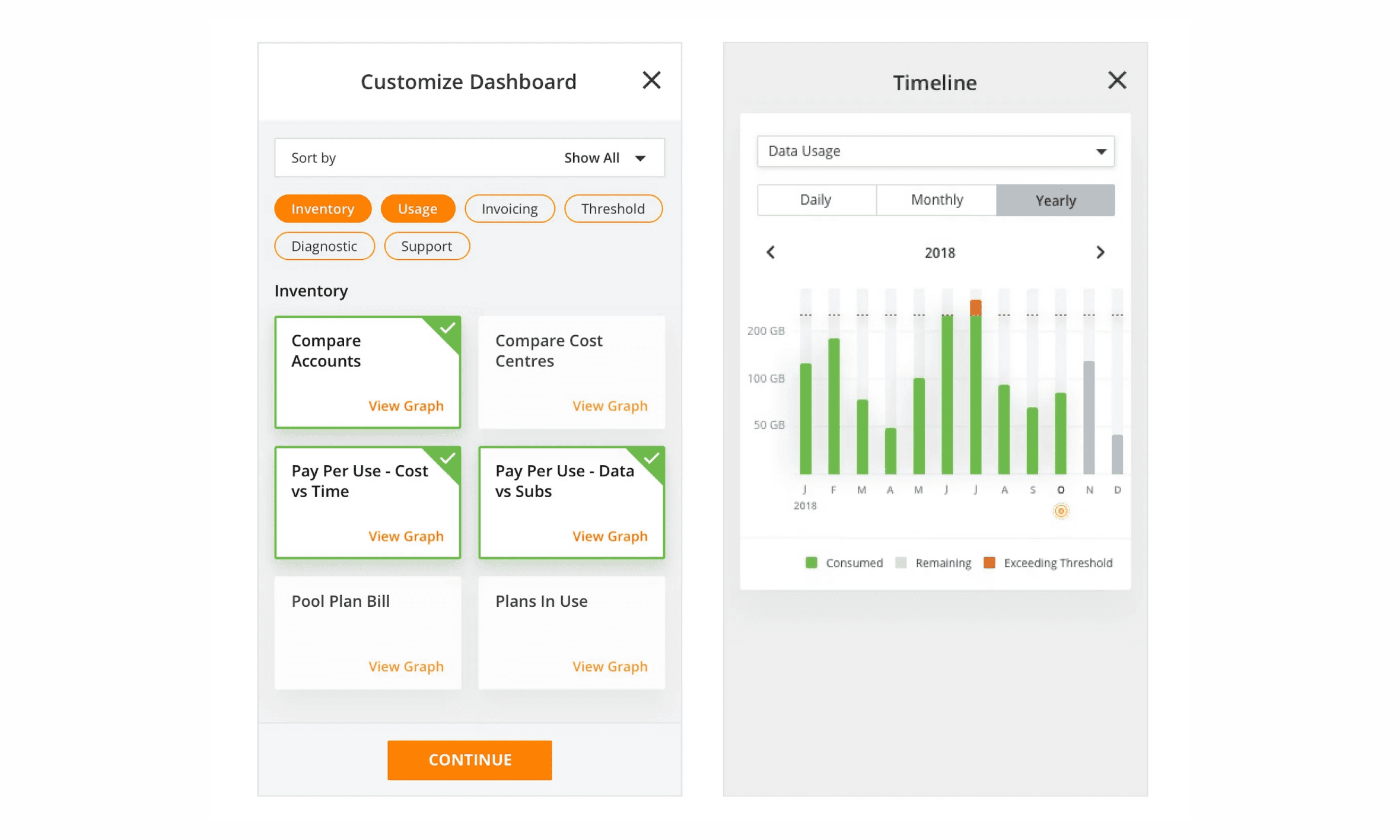
Mobile Dashboard
Designing a mobile dashboard to efficiently manage quantitative data for a fast-growing mobile-first sellers revolution.
Persona Research and Pain Points:
Persona Development: Conducted research and identified user personas to understand their needs and pain points.
Data Customization: The challenge of customizing data for easier access and understanding.
Customized Dashboard Approach:
Feature Selection: Developed a customized dashboard that allows users to choose the data they want to view on their mobile devices.
Modals and Pop-ups: Leveraged modals and pop-ups to enhance the mobile user experience.
Responsive Design Considerations:
Limited Mobile Real Estate: Addressed the limited screen space on mobile devices by providing users with the freedom to select data based on priority.
Details Screen: Enabled users to explore additional data through one-click access to the details screen.
User Research and Needs Analysis:
Information Priority: Explored users' preferences to determine the most relevant data for their dashboard.
User Actions: Identified the actions users wanted to perform within the dashboard.
User Types: Considered different user types and their specific needs for tailored data presentation.
Mobile Onboarding and Interface Design:
Feature Selection on Sign-up: Asked users to select preferred features during mobile onboarding to reduce clutter.
Minimal Interface: Maintained a clean and minimal interface with a focus on essential data widgets.
Home Page Caps: Limited the number of featured widgets on the home page, prioritizing a single-day data carousel.
By considering user preferences, optimizing screen space, and offering customization options, we successfully designed a mobile dashboard that meets the needs of users in the mobile-first sellers' revolution.